Get a free authentication code & use it with any request

Top Keywords in Review Text
You can view the top keywords mentioned in review text

Rating Distribution (Overall)
This shows the overall rating distribution for the app. It includes all reviews and ratings that were averaged to give the current rating score of the app in the app store.

Rating Distribution (This Sample Only)
This is the rating distribution taken from reviews in this data sample only. Typically these only include the latest 500-5000 reviews hence this shows you the overall user satisfaction with more recent app version and not an historically averaged rating distribution that you saw in the earlier chart.
0 - 1 1 - 2 2 - 3 3 - 4 4 - 5

Average Rating Till Date
The blue line is the average rating till date. So every new review that is published changes the overall rating score; this curve visualizes the overall impact on the rating value with each new review. If we see a string of "bad" reviews, than the average rating of this recent reviews sample (green line) will plunge below the overall rating score (orange line) and vice versa. This could mean that user satisfaction with the new app version is less than overall user sentiments across all app versions.

Word Count vs Rating Value
This chart plots the length of user reviews (Word Count) and the corresponding rating value to uncover patterns in how review detail correlates with user sentiment
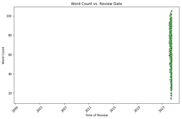
Word Count vs Review Date
This chart tracks the length of user reviews (Word Count) over time (Review Date) to identify trends in review detail and engagement across different periods.

sentiment distribution
This chart shows the sentiments of the user text.

Number of Reviews Per Year
This plot shows you how much user engagement is happening with the app. If all the recent reviews are from within past couple of years than it shows strong recent user engagement. Conversely, if number of reviews per year are skewed towards past year than it means that the app is losing user engagement and monthly active users